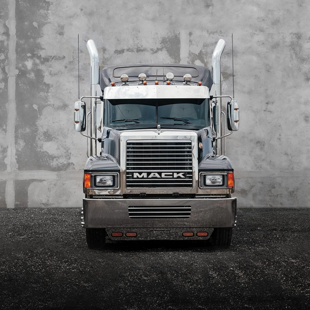
Mack Trucks
The challenge for Mack Trucks was to return the brand to relevance after decades of underinvestment, during which it found itself fighting for survival.
The solution was to amplify the elements they already owned—the iconic letters and bulldog on the front of every truck were repurposed and refined to become the logo. A completely new expression and the brand tagline “Born Ready” renewed pride in this original American icon.


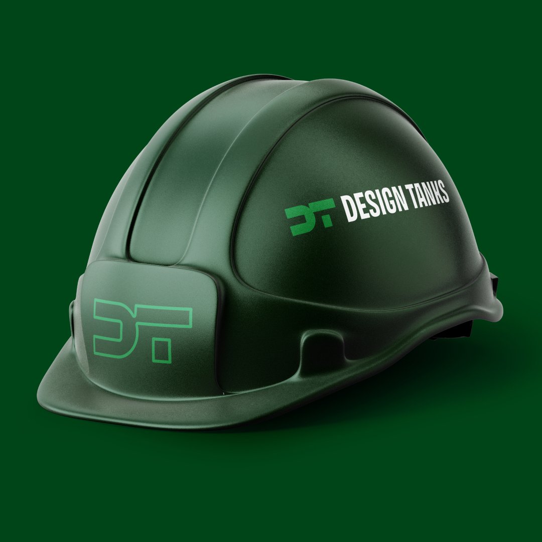
Design Tanks
Design Tanks is the leading fiberglass manufacturer of tanks for numerous industries, but they weren’t receiving recognition for their advanced technological production and proprietary processes. The rebrand reintroduced the company to the market, signaling to competitors that the industry leader was revitalized and ready to defend its top position.


Dr.G’s Ingredients
Another equity-backed brand, Dr. G’s, represents a shift from Creations to Ingredients, clarifying its focus as the leading provider of custom-created food service ingredients.
The “G” in the logo is constructed in a modular fashion, representing the process of assembling ingredients in a holistic and thoughtful way. This modular design also accentuates the brand’s scientific and highly technical approach to developing its products, reinforcing Dr. G’s reputation for precision and expertise.
The brand’s colorway, featuring red and black, was carefully chosen to elevate its visual identity. Red visually coordinates with the golden orange hues of the custom breadings they create, while black adds drama and enhances the premium positioning of the product.


Charthouse
Charthouse was an upstart in the furniture world that needed to go to market with a sense of tradition where none existed. I balanced the need for modernity with the appropriate level of tradition to create a seal that could be used as a visual asset, separate from the wordmark, suggesting a legacy and heritage for the brand.


Bandag
A division of Firestone, Bandag is the industry leader in retreading tires. And no, there’s no changing that term, unfortunately. Since we couldn’t modernize what they’re known for, we modernized the brand identity to embody a sense of rolling and movement.
Additionally, it was crucial for the logo to perform in the most challenging conditions. The line weight and presence were carefully considered to ensure the logo wouldn’t disappear in less-than-ideal circumstances.
Along with the signature yellow color, the yellow line under the letters from the previous logo was important to keep, as it maintained high brand awareness.


