Revert Technologies

For Revert, the challenge was to evolve from their initial brand identity into a newly focused, technology-driven brand, positioned to compete against much larger competitors with more specialized offerings. By adding “Technologies” to their name, they are now poised to occupy a distinct space in the minds of their customers. 

The logo symbolically represents the transfer of energy, featuring two nuanced capital letter “R”s and a red line indicating the stopping or control of energy flow, aligning with their mission of managing energy consumption effectively.

Animated Revert Technologies logo
Close-up of a smartphone screen showing app icons: Revert Tech (black with red diagonal line), Photos (multicolored flower), Gmail (multicolored M), and Google Calendar (blue with "31").
Circular device with "Revert Technologies" logo and screws on a dark background.
Person presenting a slide with "Revert Technologies" logo to an audience
Person with tattooed arm holding a coffee cup, wearing a black t-shirt and a backpack in an urban setting.
A multifunction printer with a red diagonal line indicating prohibition or error.
Infographic displaying icons and text: remote access (smartphone icon), money saving (dollar sign), emission reduction (lightning bolt and arrow), AI powered (sparkles and circuit), impact reports (bar graph).
Red business card for Revert Technologies featuring professional title, contact details, and company slogan.
Diagram with a red arrow connecting 'Energy Savings' to 'Sustainability Goals.'
Exhibition booth design for Revert Technologies, featuring modern graphics of electronic devices. The setup includes a wall with branding, slogans like "Plug in. Start saving," icons signifying benefits, a small table with two chairs, and a black cube with a logo.

HouseFacts

HouseFacts is an equity-funded product in development, created to solve a specific problem for homeowners and address a gap in the marketplace.

More information will be available when the product launches. 

The brand identity needs to embody a sense of approachable and non-threatening simplicity, reflecting the inherent ease and user-friendliness of the product.
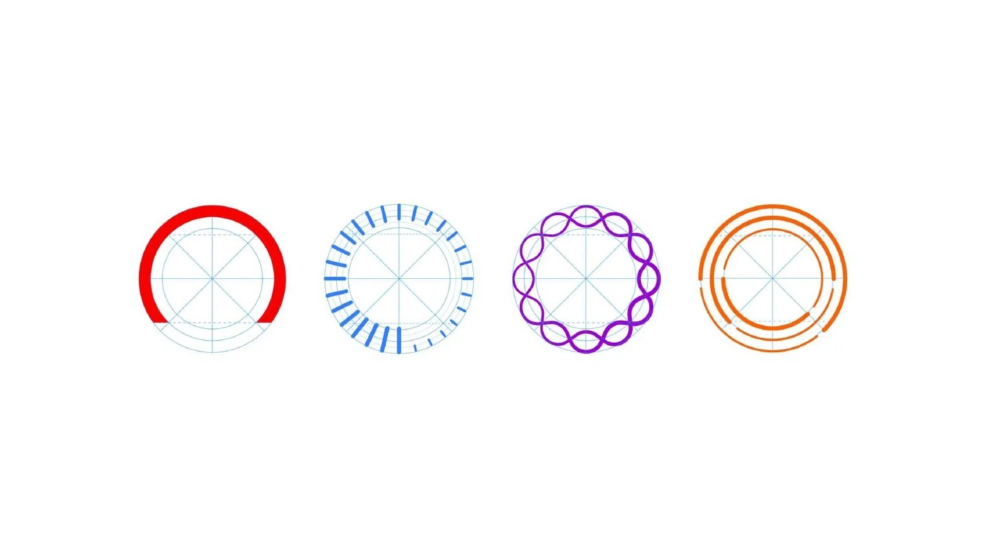
Animated HouseFacts logo
HouseFacts website
HouseFacts logo shown on app tile
HouseFacts logo on keychain
HouseFacts billboard mockup
HouseFacts website module example

Centerboard

With a new name, strategy, identity, and expression, Centerboard is a rebrand of a market leader in the logistics industry, aiming to create distance between themselves and an increasingly competitive landscape. In a traditionally paper-based industry, it was crucial that this new brand telegraphed technological acumen, signaling a shift toward modern, tech-driven solutions.

The dashes in the logo represent the lines in the middle of a highway, reinforcing the connection to movement and logistics.

Centerboard on a dark blue background.
Person wearing a dark blue T-shirt with a large white "C" logo, holding a notebook labeled "CENTERBOARD," featuring vertical design bars.
ID badge with lanyard featuring a photo and the name "Jennifer Anderson," associated with "Security Technology," and branded with "CENTERBOARD."
Image of multiple presentation slides showcasing Centerboard brand guidelines. Slides feature text on strategic messaging, brand voice, and visual identity, along with color palettes and design elements like bottles and merchandise with Centerboard branding.
Trade show booth with a "Centerboard" display, featuring a truck driver and a highway scene; text reads "Take charge. Move forward."
Hanging banner with the word "CENTERBOARD" at the top, featuring images of two professionals and the text "Changing the way we move." in an office setting.
Two posters with motivational phrases, "Own what's next" and "Lead the way," both branded with "CenterBoard."

Morningstar

Morningstar is the brand you encounter everywhere without realizing it. Chances are, you interact with Morningstar data more often than you think. Their financial intelligence and ratings systems serve as the backbone of countless financial products. Over time, however, their product architecture had grown unwieldy, lacking structure and creating confusion both internally and externally.

The challenge was to create a sub-brand system that aligned business units to be distinct yet coordinated with the primary Morningstar brand, bringing clarity to their structure without losing cohesion.

Four abstract circular patterns with different colors and designs, including red, blue, purple, and orange for Morningstar
Man standing behind a counter with digital displays; the left screen shows the Morningstar logo, the middle screen shows a man holding a tablet, and the right screens display abstract patterns and a tall building.
A digital advertisement for "Personal Solutions" and "Morningstar Premium" featuring a man at a computer with a child and a panda, sample text placeholders, and product images including a VR headset.
Image showcasing a brochure and advertisements for Morningstar's Strategic Solutions. The brochure features a cover with a photo of two people conversing, decorated with a purple and red wavy pattern. Adjacent are three ad designs with purple and red graphics, showing people and capsules, with text blocks labeled "Managed Portfolios." The background is purple and white.
Corporate marketing materials featuring Morningstar branding, with an image of colleagues discussing in an office and various digital ads with text placeholder and microchip graphic.
A large screen on a stage displaying text about Morningstar solutions categorized as Personal Solutions, Strategic Solutions, and Professional Solutions, with a person standing in front of the screen and an audience watching.
Three standing banners with abstract line designs and text for "Personal Solutions," "Strategic Solutions," and "Professional Solutions" by Morningstar.