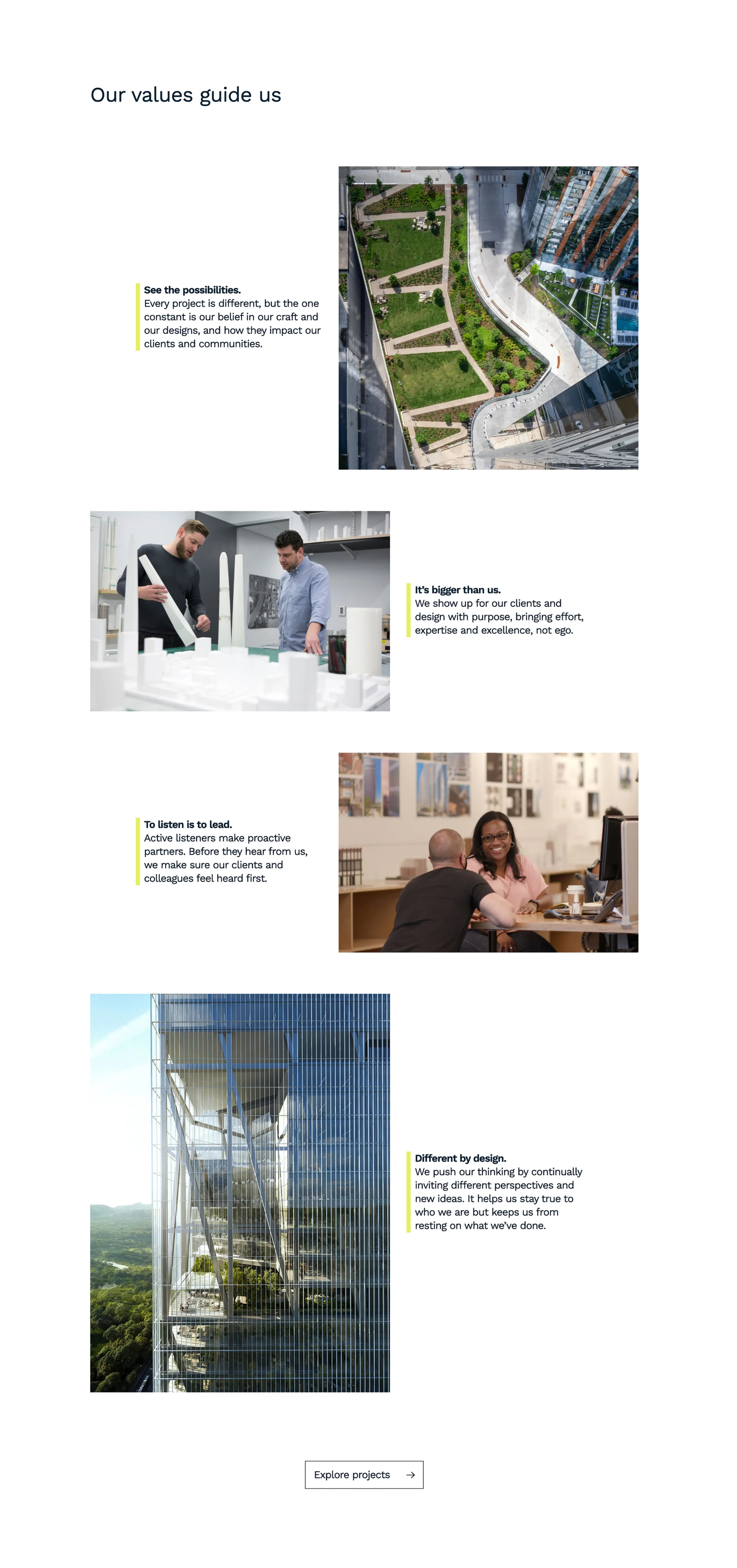
bKL Architecture
Website and Identity optimization

bKL Architecture
As one of the nation’s preeminent architecture firms known for their stunning work in tall towers around the world, bKL needed a new site that properly reflected the breadth of their diverse practice. A new brand strategy, brand expression, and UX are featured throughout, ensuring the site equally portrays their mission and vision while raising awareness of their deep portfolio of thoughtful work. View site.

Collage of architecture and design images exemplifying values: aerial view of urban landscape, two men discussing architectural models, a woman and man in discussion at a desk, and a modern skyscraper. Text includes "See the possibilities," "It's bigger than us," "To listen is to lead," and "Different by design." Button: "Explore projects."
Office interior with glass partition, bookshelf, desk, and blurred figures walking; text reads 'Designing with intent, building with purpose.'"
Collage of architectural categories with images labeled Housing, Interiors, and Mixed-Use, showcasing building exteriors and stylish office space.
Architectural firm website homepage featuring modern office interior, image of a spacious office, project categories such as housing, mixed-use, office, civic, education, and interiors with respective building images. Includes navigation menu and contact option.

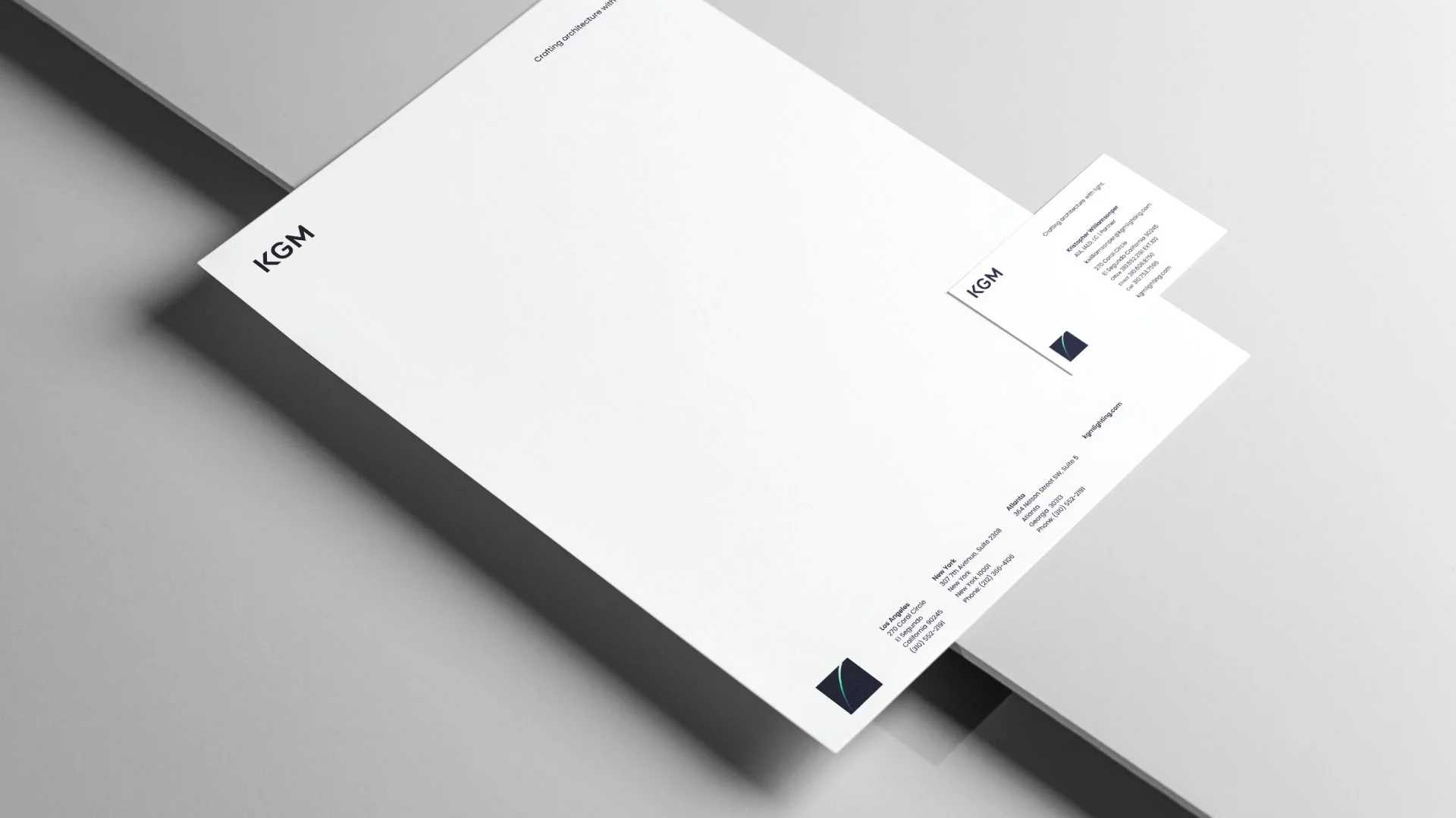
KGM Architectural Lighting

As a leading architectural lighting firm with national and international credentials, KGM needed a brand identity that matched the sophistication and nuance they bring to their highly thoughtful work. The solution was a proud and confident wordmark, freed from its square container, paired with a subordinate symbol featuring an arc of light, which became
the foundation for an expansive visual system.

KGM Logo on a dark blue background
Glass door with KGM logo featured
Minimalist stationary design with letterhead and business card. The letterhead displays the logo "KGM" in the top left corner and contact details at the bottom. The business card is partially visible with the same logo and additional contact information.
Person wearing a navy blue t-shirt with a geometric design and "KGM" logo on the sleeve.
Open notebook on a wooden table with a dark, abstract design and the text 'Crafting architecture with light.'

Shiel Sexton

This construction management firm had a laser-focused mission: to gain the trust of visionary architects by proving they were the firm that could be relied on to execute an architect’s vision. To achieve that, the firm needed to demonstrate an affinity for design by representing their own brand with sophisticated, thoughtful design choices.

Each “S” was created as a life-sized sculpture, placed in their corporate office, and graphically optimized as a suite of logos, intentionally designed to elevate their visibility in the industry.

While the name Shiel Sexton appears in the design system, it’s the “S’s” that are the visual stars. They became known for the enormous “S’s” featured on signs at each of their project sites.

Also, I’m the blurry guy.

Various uppercase "S" letters designed with different textures and materials on a white background.
Stationery set with Shiel Sexton branding, including letterhead, envelopes, and business cards, with a prominent stylized "S" logo on a wooden background.
Office hallway with a large plug sculpture on the wall, showing red curved pipes and a black plug end. Blurred figure and fire extinguisher in the background.
Large rusted metal letter "C" sculpture in a bright interior space.
Industrial-style letter "J" on brick wall with blurred person walking by
Metallic letter G wall decoration with industrial design
Shiel Sexton Logos shown on a construction fence